POS
Designing complex operations for a small screen.
Built for the people doing the work.
POS serves store and warehouse owners, with inventory staff and cashiers using the system to count stock, enter items, and issue invoices. The design needed to support detailed operational work on a device small enough to use on the floor.
I built the product design from the ground up.
I was responsible for designing the experience from scratch. My focus was translating the demands of inventory and invoicing into clear screens and connected steps, then refining the design as real users tried it and shared feedback.
A lot of detail. Very little space.
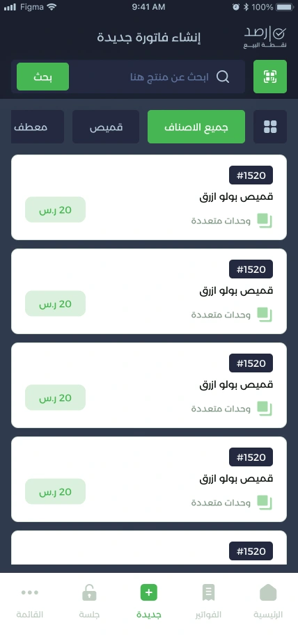
The hardest part was the volume of work: counting and entering many items, then handling invoices with long product lists—all on a screen the size of a phone. My design priority was to keep each task understandable without losing the information people needed to complete it.
Make long item lists manageable.
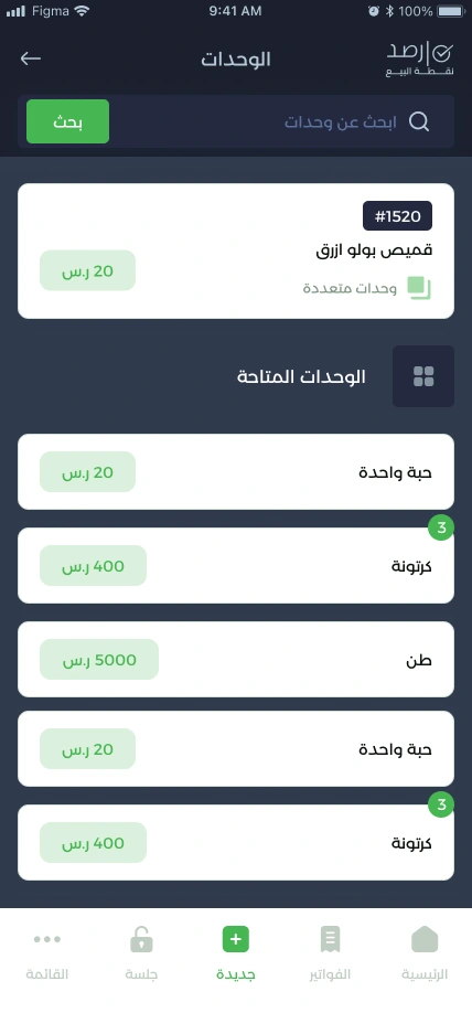
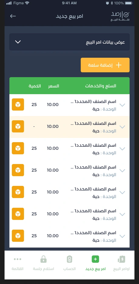
I structured item selection around finding the product, choosing its unit, and reviewing its quantity in the invoice. Separating these steps gives each decision its own space, while the invoice brings quantities and totals together for review.
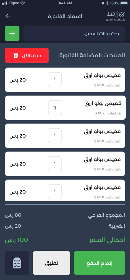
Give each transaction a clear place.
I organised invoices, suspended transactions, and returns into distinct views. This keeps different tasks separate on a limited screen and gives the cashier a clear starting point when returning to an earlier transaction.
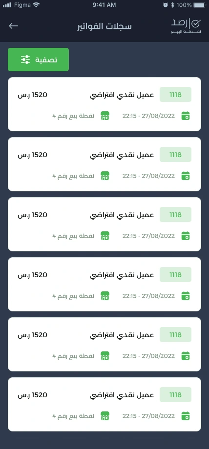
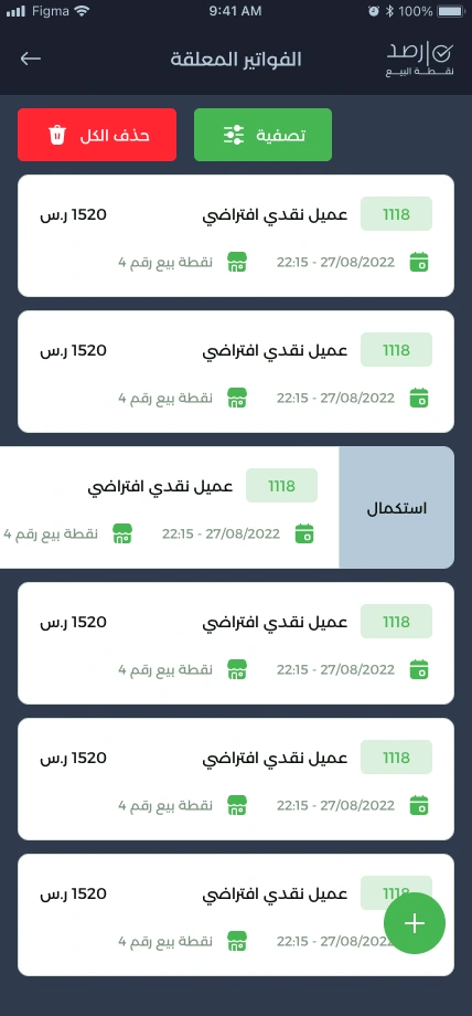
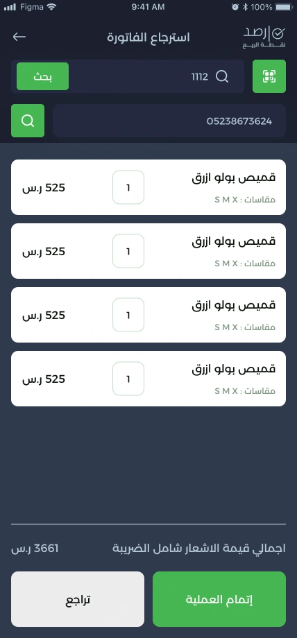
Connect individual actions to the working day.
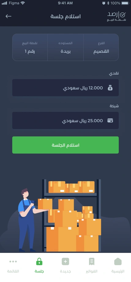
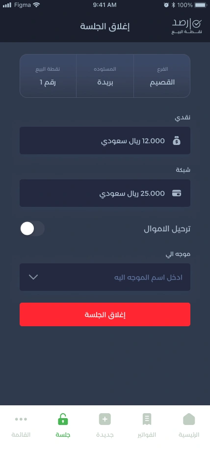
I designed the session screens to show the branch, warehouse, and balances alongside the relevant action. The aim was to preserve the operational context as the cashier moves between receiving a session, creating a sales order, and closing the session.
Design beyond the moment of sale.
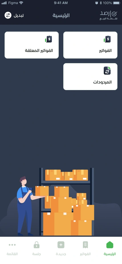
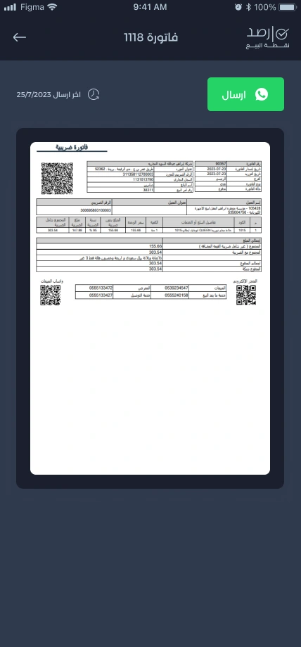
My scope also covered invoice output, print settings, and the home screen that brings the main operations together. These screens connect the detailed work of building a transaction with its final record and the next task.

Real use shaped the next iteration.
Real users tried the system and brought feedback back to the team. We worked through the issues they encountered and continued improving the experience. For me, the design work extended beyond the first delivery: each round of feedback helped identify what needed to be clearer or easier in day-to-day use.
The full POS experience, in motion.
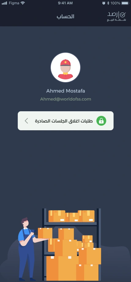
Browse the finished screens across product selection, invoices, returns, sessions, printing, and account access.