Visa Application App
A clearer path through a demanding application.
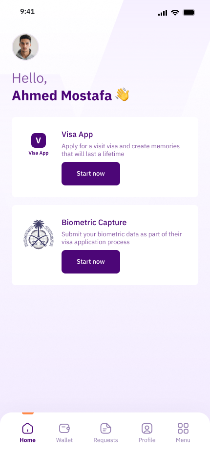
A visa application that fits on a phone.
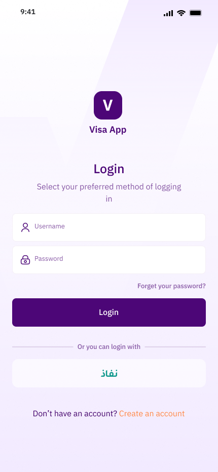
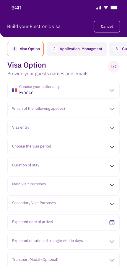
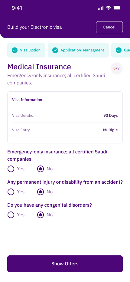
A mobile app that lets people around the world apply for a visa to enter Saudi Arabia. The service already had a web version for entering application data. The mobile app had to handle the same detailed process on a smaller screen, and add a new step: applicants capture their own biometrics with the phone camera.
I designed the mobile app and the biometrics journey.
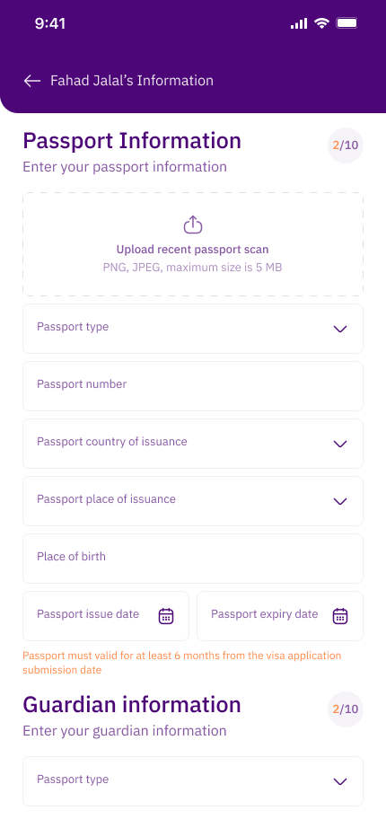
I designed the mobile experience from visa selection to payment, including group applications and the full biometrics flow: passport scan, face capture, and fingerprint capture.
Two problems that grow with every traveler.
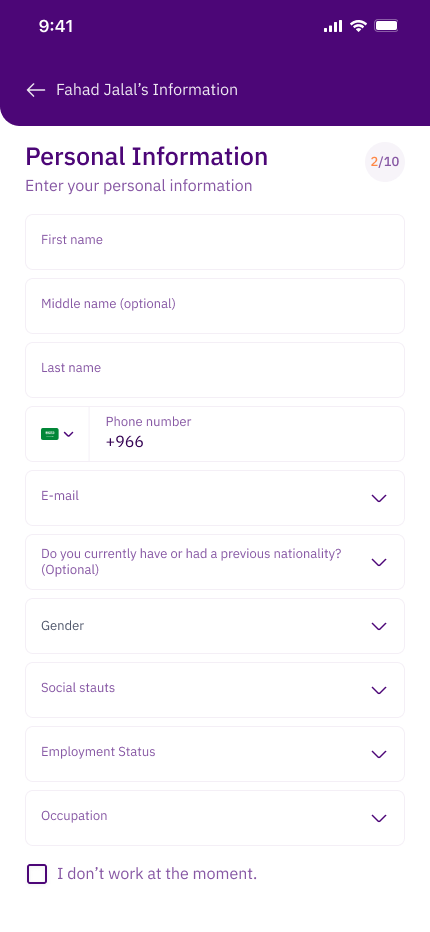
First, group applications multiply the work. Each traveler needs a full set of personal, passport, and residency details. Second, every applicant must scan their passport, face, and fingerprints by themselves. Many of them are not used to doing this with a phone camera, and a bad capture can delay the whole application.
Each traveler completes their own part.
Why: One person filling in long forms for a whole group is slow and leads to mistakes. Each traveler knows their own details best.
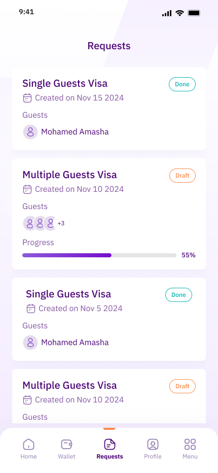
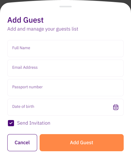
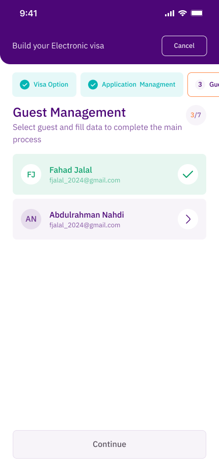
Decision: When the main applicant adds a guest, they can send an invitation. The guest then completes their own information. The main applicant sees the status of every guest in one list, with a clear note when someone still has missing information.
Trade-off: The main applicant now depends on others to finish. I made each guest's status visible so they always know who is holding the application back.
Prevent bad captures instead of rejecting them later.
Why: A failed capture is frustrating, and it is discovered too late if the app only checks the result at the end.
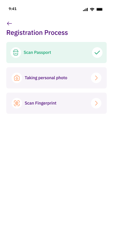
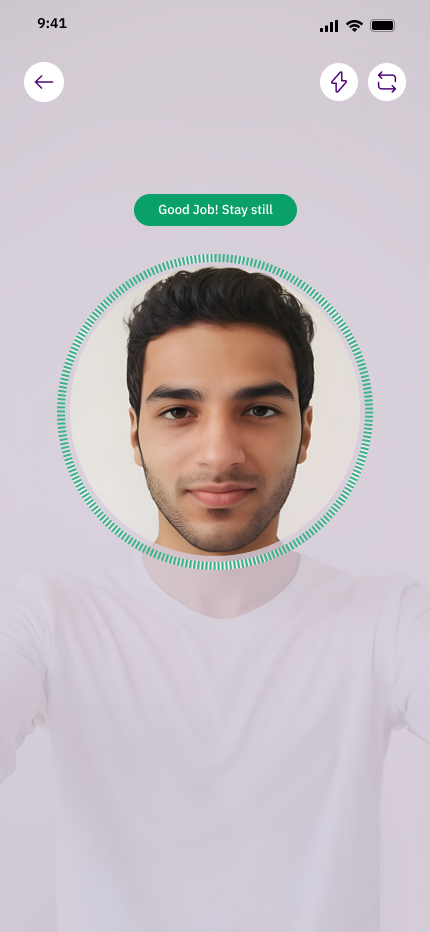
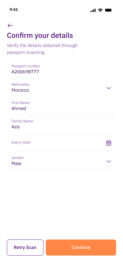
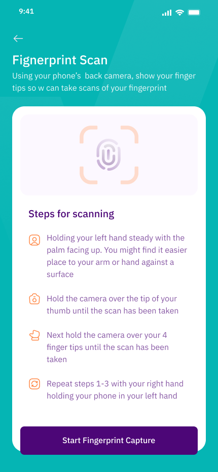
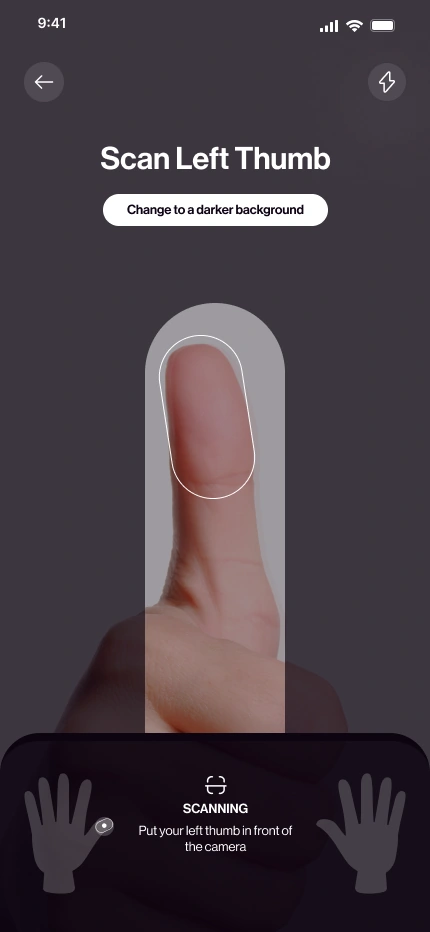
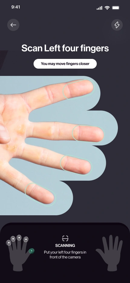
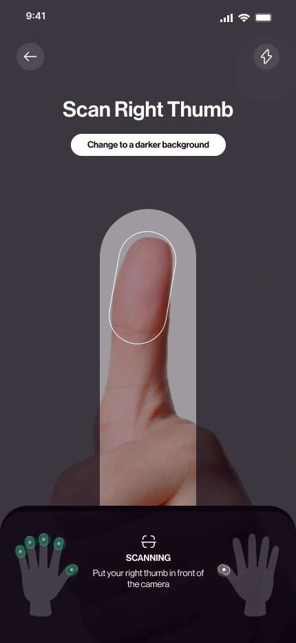
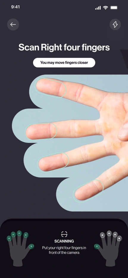
Decision: I designed every capture in three parts. Before: a short screen that explains how to get a good result. During: live hints from the camera, such as avoiding glare, changing the background, or moving the fingers closer. After: the applicant reviews the result and can retry. For the passport, the app reads the details and asks the applicant to confirm them.
Trade-off: This adds steps to each capture. A progress screen shows which captures are done, so applicants can stop and come back without losing their work.
Four guided captures, one clear task.
Each applicant scans the left thumb, the left four fingers, the right thumb, and the right four fingers. A hand indicator at the bottom shows which finger is next, and a short hint explains what to adjust.
A clear end to a long process.
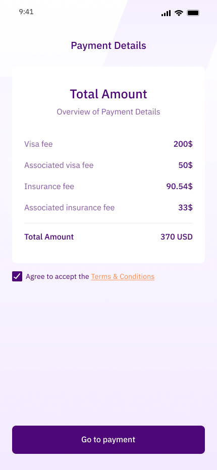
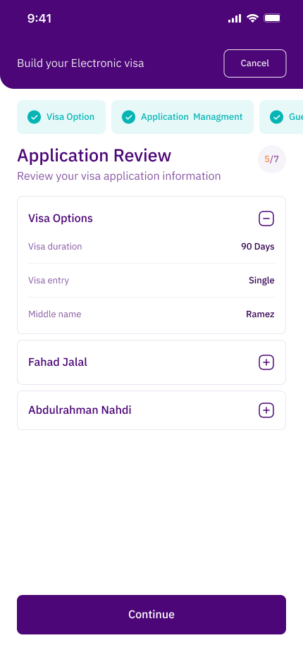
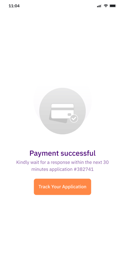
The applicant reviews the fees in one view, pays, and can follow the request after submission.
Where the design can go further.
The current flow prevents most capture problems, but it does not yet define what happens after repeated failed attempts. That would be my next step, together with letting group members reuse shared details such as travel dates and address.
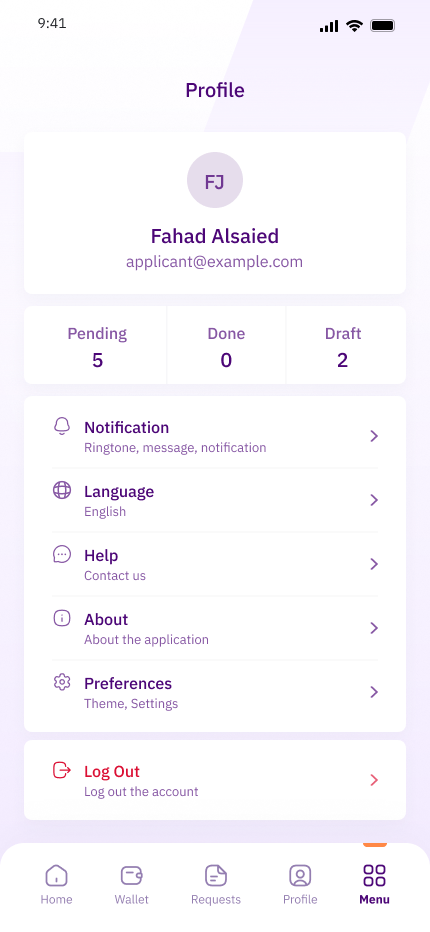
The wider application experience.