Corners
A new category, designed from scratch.
I designed the restaurant experience as Corners expanded from handmade goods toward a broader app for everyday services.
An existing app with a bigger ambition.
Corners began as an app for handmade goods. The team wanted to grow it into a multi-service app with restaurants, supermarkets, and more. Restaurant delivery was the first new category.
I designed the restaurant experience from scratch.
I developed the product design for this expansion, shaping the restaurant journey from discovery and menus to the basket, checkout, and order follow-up.
Understand the market before shaping the flow.
Food delivery apps already have patterns customers know. I needed to understand how the category works and which details people expect to see while choosing a restaurant, ordering a meal, and waiting for delivery.
Put the right information at each decision.
I organised the restaurant journey around the questions customers already bring to a delivery app: what is available, what a meal includes, what the order will cost, and when the restaurant confirms it. Each answer appears where it helps the next decision.
A useful starting point, before the first tap.
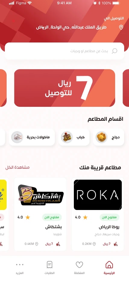
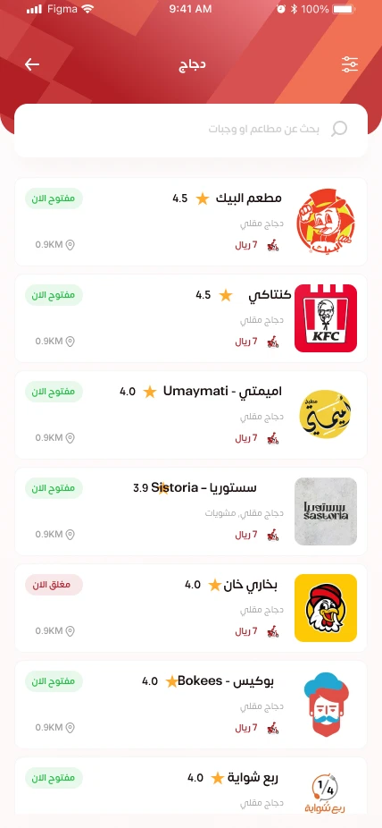
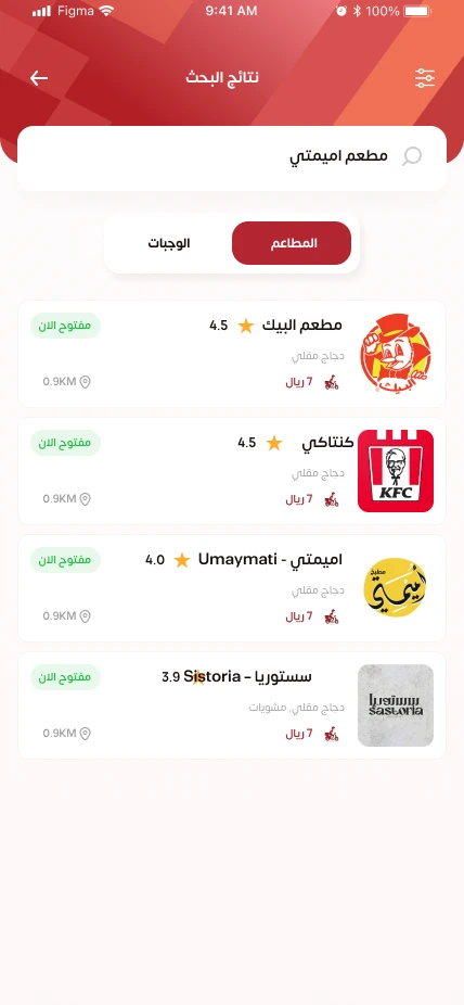
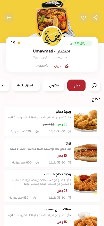
The home screen anchors discovery to the delivery location. Categories, search, ratings, opening status and delivery information help customers narrow their options before they open a menu.
From an appealing menu to a specific order.
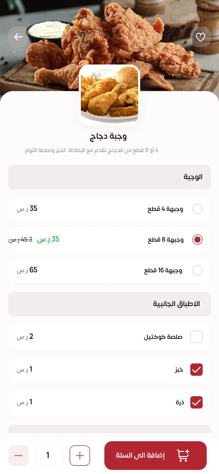
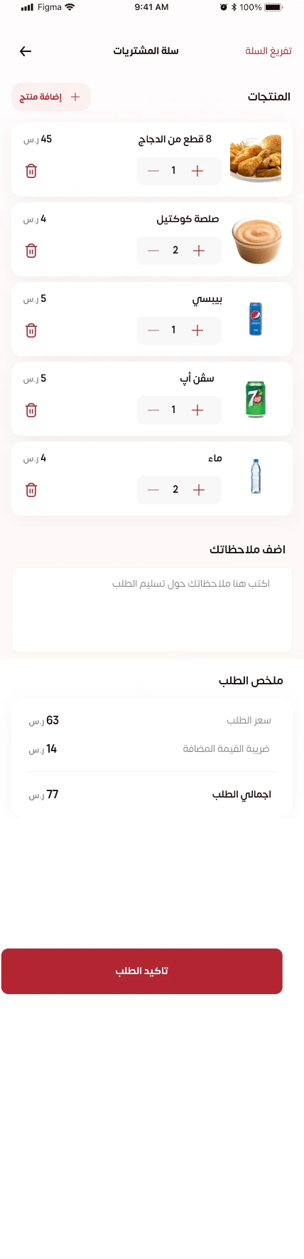
Restaurant categories organize the menu, while the meal screen separates portion choices from optional extras. The basket brings quantities, notes and the price breakdown together before confirmation.
Close the gaps before placing the order.
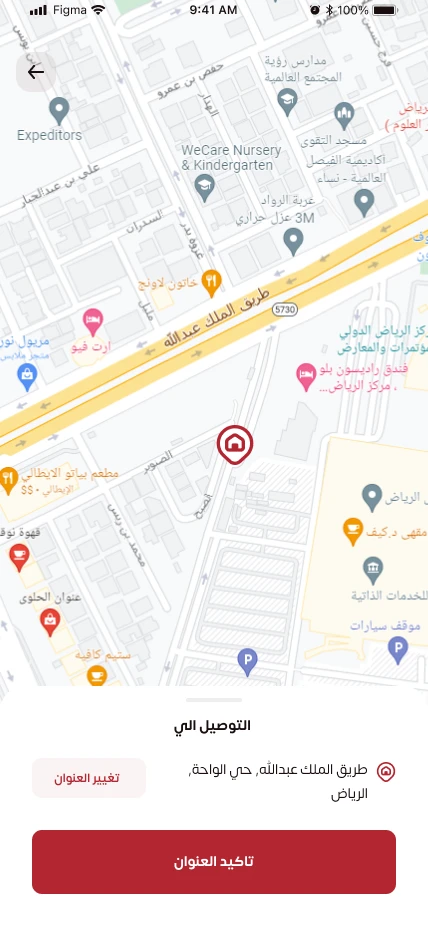
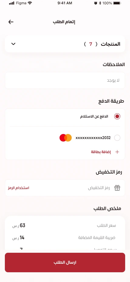
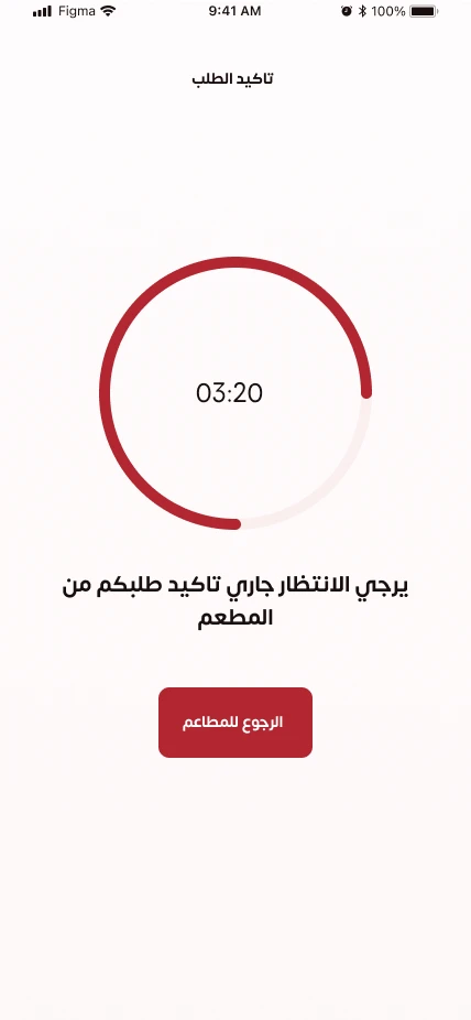
A map-based address confirmation connects the order to a delivery point. Checkout exposes payment options, a discount field and the order total. A separate waiting state makes restaurant confirmation an explicit step.
The experience continues after checkout.
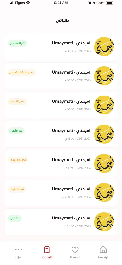
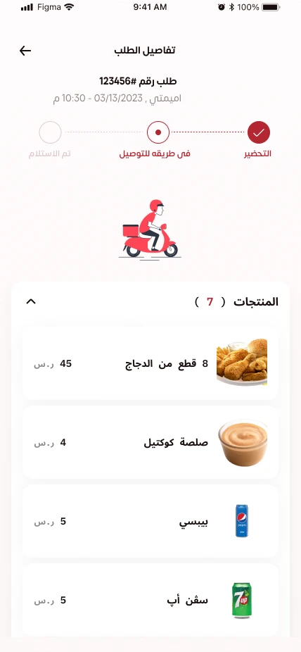
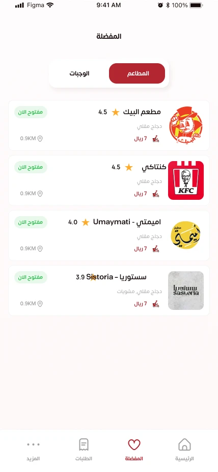
Order history distinguishes past and current orders. The order detail view keeps the status, items and the customer’s next point of reference in one place, while favorites provide a shorter route back to familiar restaurants.
A clear path through an everyday decision.
A warm red identity, image-led menus and Arabic right-to-left layouts connect the journey from the first introduction to the next order.
Explore the Figma file ↗
Designed, developed, and released.
The restaurant experience moved beyond the design files: Corners was developed and released on the app stores. The expansion became a live product customers could use.
Explore the complete journey.