Fittpub.
Healthy eating, made easier to live with.
Healthy eating has to work every day.
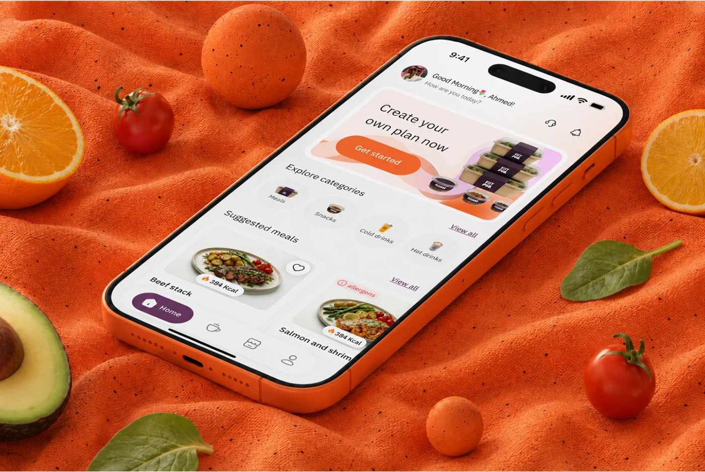
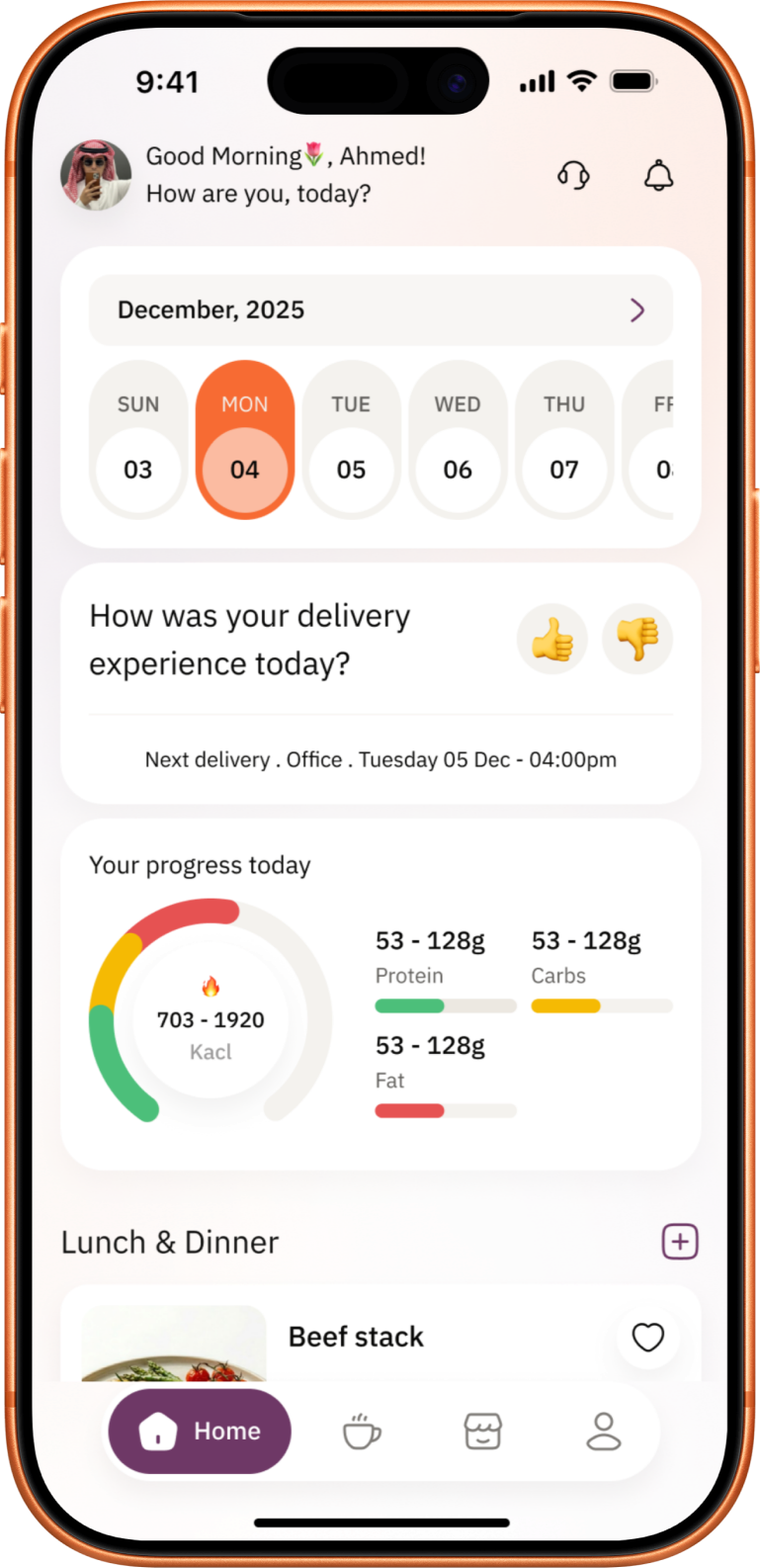
Fittpub combines meal planning, food discovery, progress tracking, subscriptions, and delivery in one mobile experience. The challenge was to make those separate moments feel like one manageable daily routine.
I shaped the experience from insight to interface.
I analyzed public reviews and competitor experiences, framed the product around recurring frustrations, mapped the information architecture and user flows, then designed wireframes, the mobile interface, and a reusable visual system across more than 50 screens.
A plan needs room for real life.
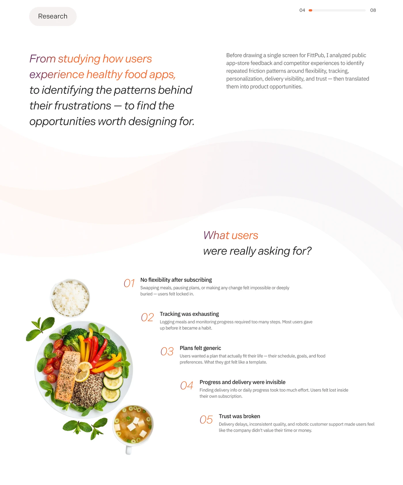
The research pointed to friction around rigid plans, unclear progress, and limited control after subscribing. I used those signals to make flexibility, visible progress, and the ability to adjust meals central to the experience.
Keep choices connected to the goal.
I organized the journey from personal goals to a daily plan, meal discovery, tracking, and delivery. Meal details, nutrition, replacement choices, and cart changes sit close to the decision, so users can adapt their routine without losing context.
I designed from repeated friction—not assumptions.
I analyzed public reviews and competitor experiences, then reframed Fittpub around flexibility, visible progress, and control after subscribing.
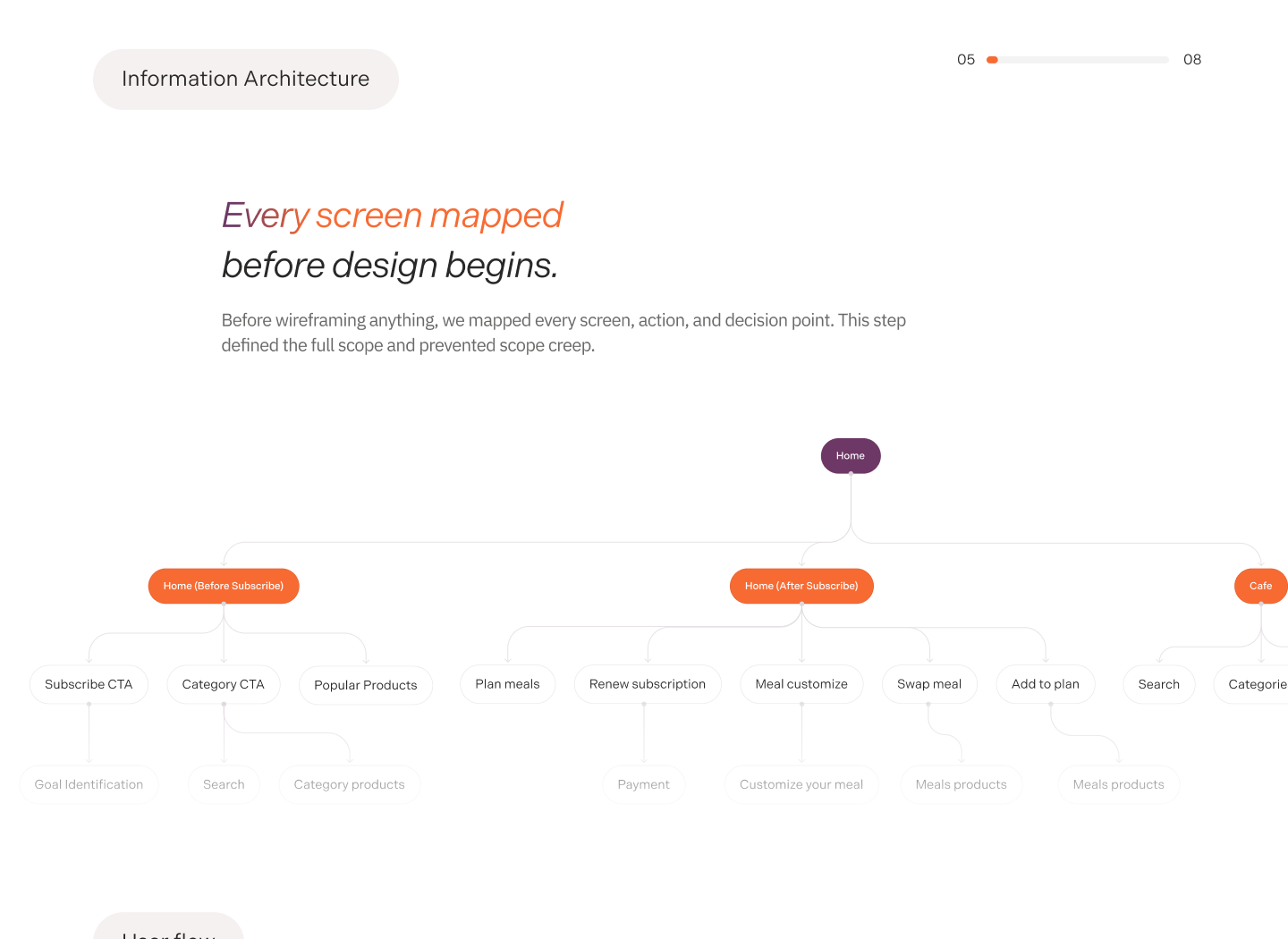
I mapped the full product before styling a screen.
More than 50 connected screens were organized into clear journeys for discovery, subscription, daily progress, meal changes, and delivery.
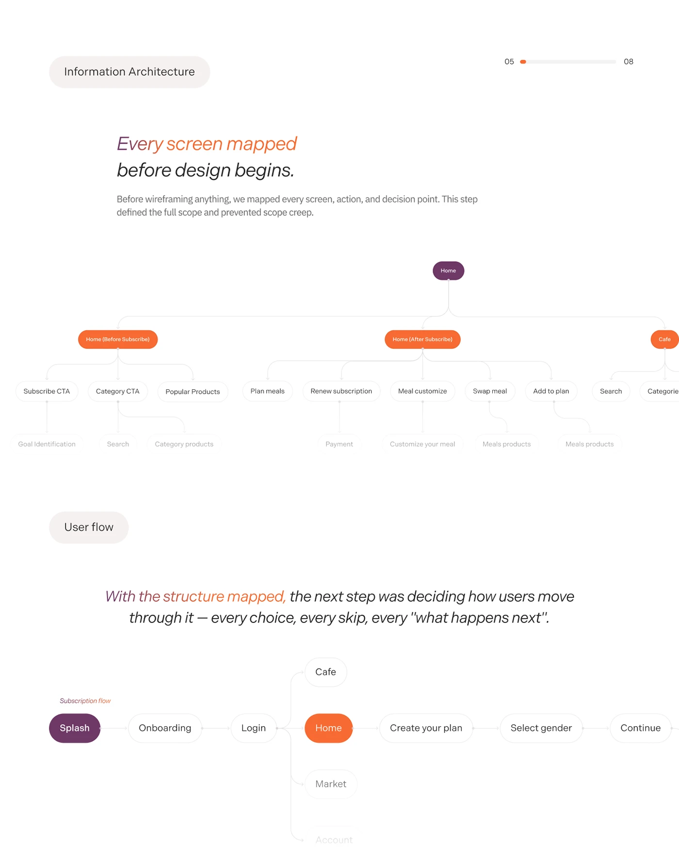
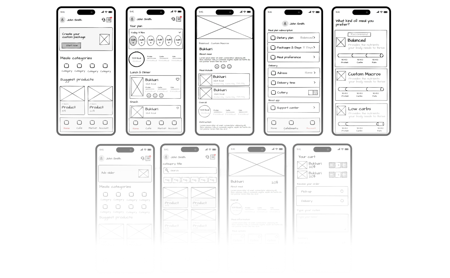
Structure before polish.
I worked through hierarchy, actions, and screen-to-screen logic in wireframes before introducing the visual layer.
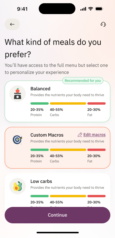
Personalize. Plan. Track.
I kept the user’s goal visible across setup, everyday progress, and the choices that shape each plan.
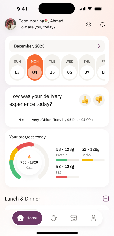
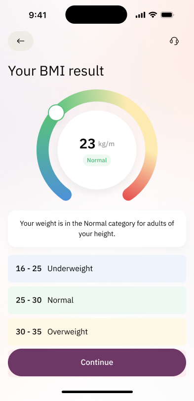
One routine, with room for real choices.
The experience moves between a personal plan, the wider market, and café options without breaking the user’s progress or daily context.
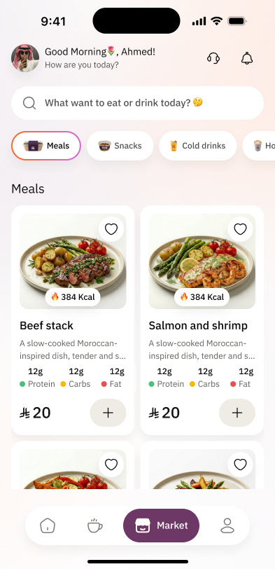
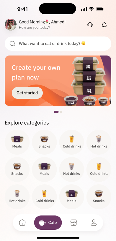
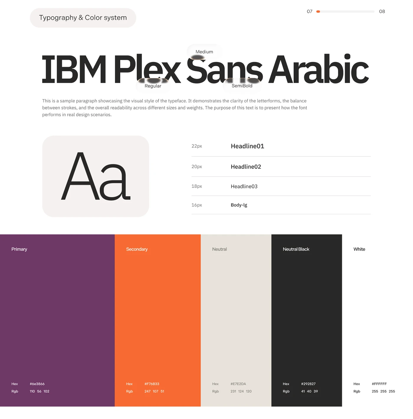
One visual language across 50+ screens.
I built the typography, color, and reusable interface rules to keep a broad product consistent and ready for delivery.
Decisions stay close to the meal.
Meal details, nutrition, customization, and cart changes stay in context so users can adjust without losing momentum.
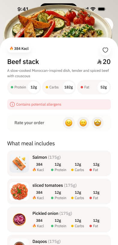
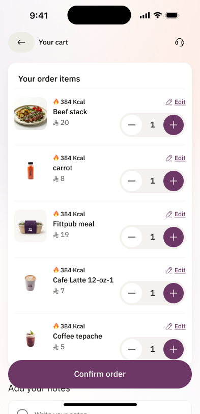
Change the plan without losing the plan.
I kept nutrition, replacement choices, the active order, and account context connected so adjustment feels like part of the routine—not a separate task.
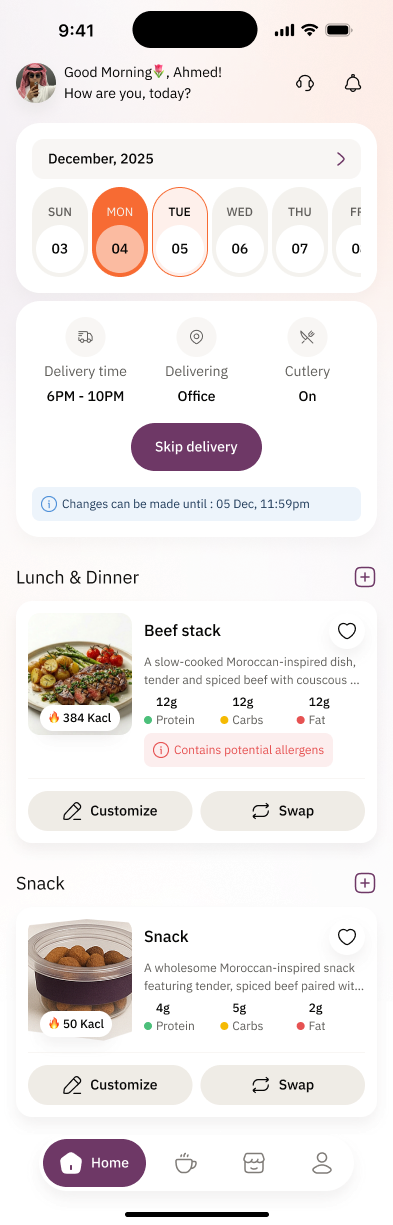
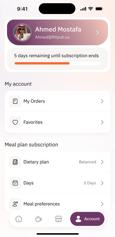
The wider product was designed—not left as edge cases.
Onboarding, support, account, subscriptions, allergies, and delivery states follow the same product logic as the core journey.
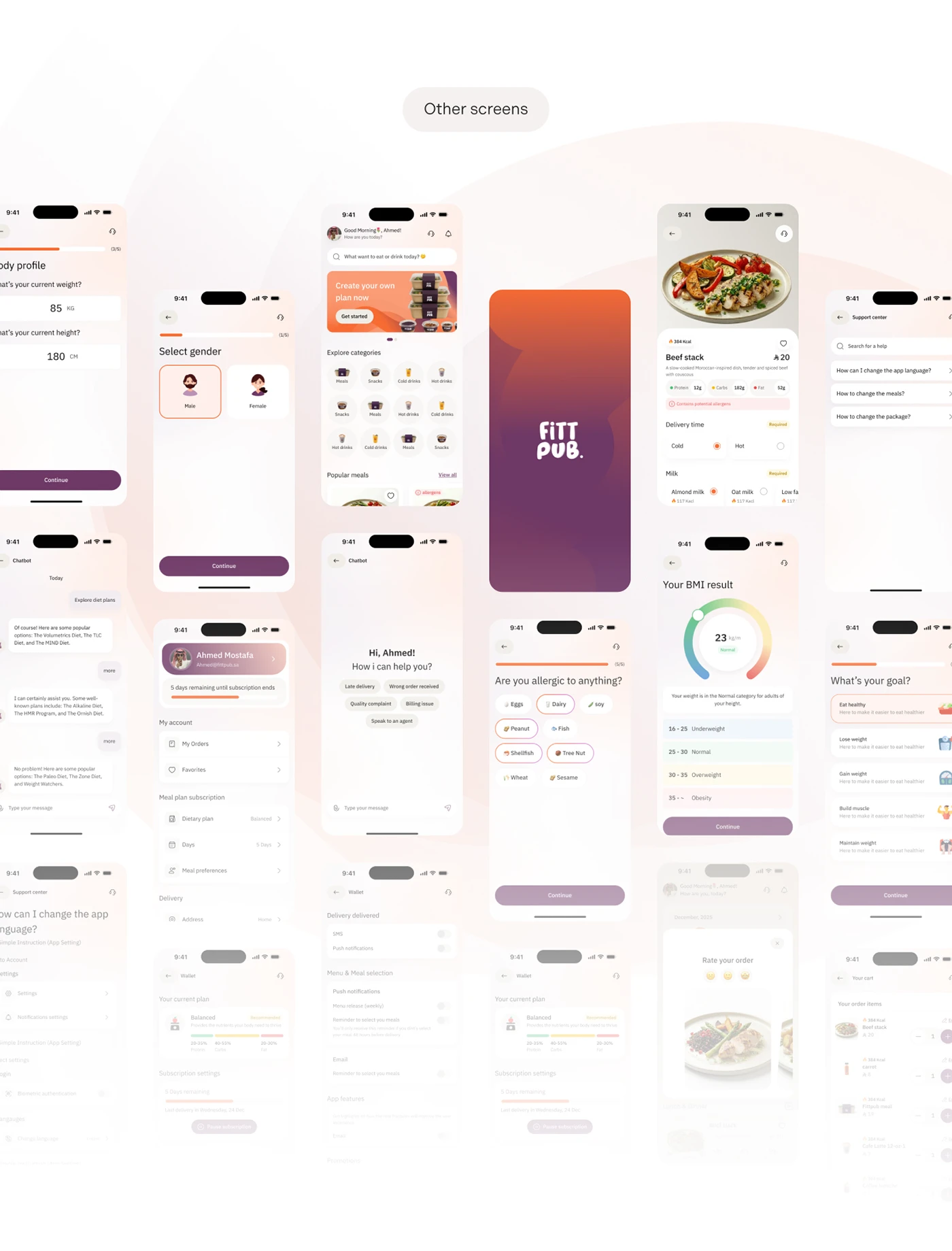
The screens work as one product.
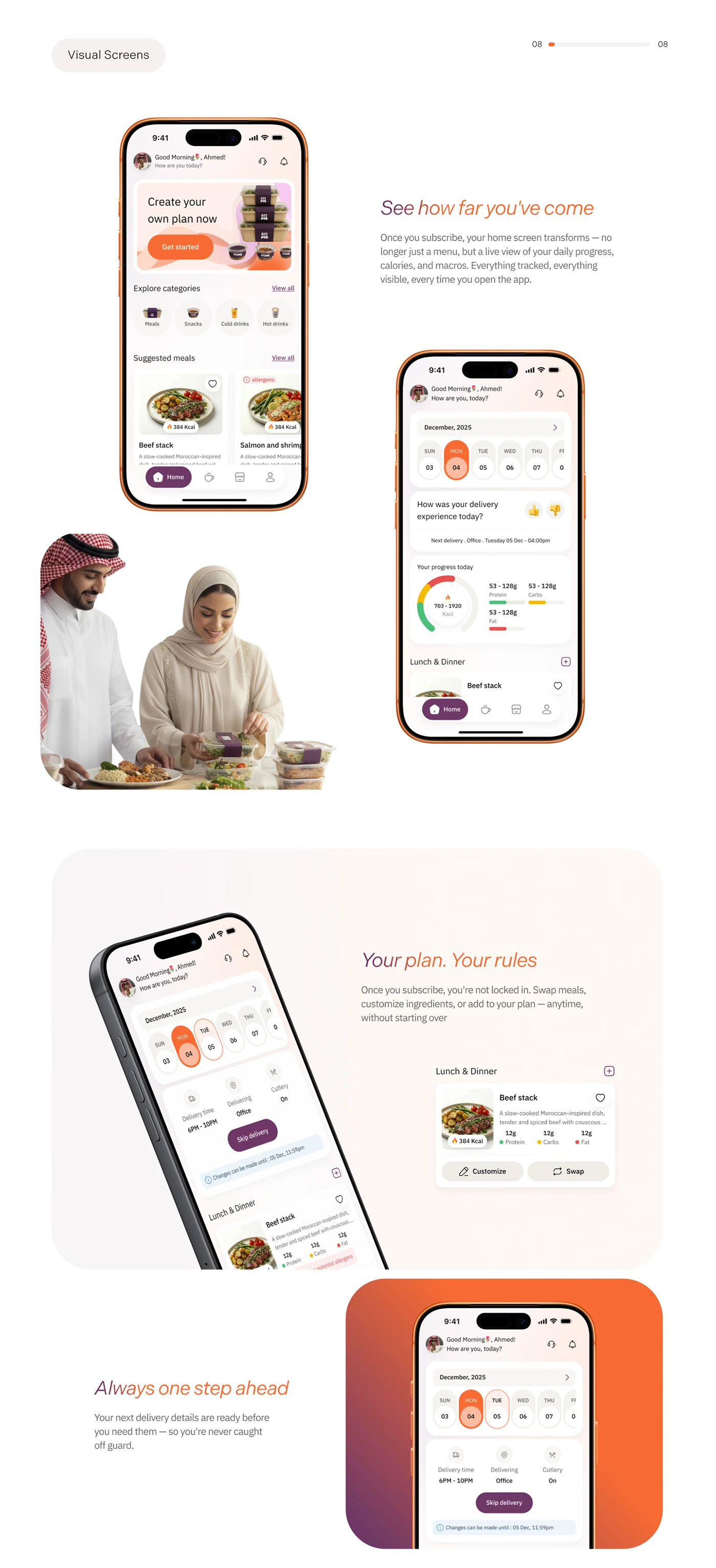
The product, in motion.
A connected product that stays useful after checkout.